Обсуждение: Version 13 documentation layout is harder to read than version 12
The following documentation comment has been logged on the website:

Page: https://www.postgresql.org/docs/13/functions-json.html
Description:

Compare:
* https://www.postgresql.org/docs/13/functions-json.html
* https://www.postgresql.org/docs/12/functions-json.html

I know it is just my opinion, but the version 12 layout is easier to read
than version 13.

The table in version 12 was just easier to understand.
PG Doc comments form <noreply@postgresql.org> writes:
> Compare:
> * https://www.postgresql.org/docs/13/functions-json.html
> * https://www.postgresql.org/docs/12/functions-json.html

> I know it is just my opinion, but the version 12 layout is easier to read
> than version 13.

IMO, table 9.47 (JSON Processing Functions) is pretty much the poster
child for why we had to redesign the table layout.  In the old layout,
it's close to unreadable in any normal-size browser window, despite
wasting lots of whitespace and having large amounts of important info
shuffled off into "Note" blocks.  The new layout is far more adaptable
to viewing windows that aren't full-screen-width; and the "Note" text has
all been merged into the table, so that you don't have to scroll down and
back to find all the info about a function.

I'll concede that it's a bit of a shock at first if you are used to the
old layout.  But the developer community has been looking at this format
for six months or so now, and I think people grew accustomed to it fairly
quickly.

            regards, tom lane
PG Doc comments form <noreply@postgresql.org> writes:
> Compare:
> * https://www.postgresql.org/docs/13/functions-json.html
> * https://www.postgresql.org/docs/12/functions-json.html
> I know it is just my opinion, but the version 12 layout is easier to read
> than version 13.
IMO, table 9.47 (JSON Processing Functions) is pretty much the poster
child for why we had to redesign the table layout. In the old layout,
it's close to unreadable in any normal-size browser window, despite
wasting lots of whitespace and having large amounts of important info
shuffled off into "Note" blocks. The new layout is far more adaptable
to viewing windows that aren't full-screen-width; and the "Note" text has
all been merged into the table, so that you don't have to scroll down and
back to find all the info about a function.
I'll concede that it's a bit of a shock at first if you are used to the
old layout. But the developer community has been looking at this format
for six months or so now, and I think people grew accustomed to it fairly
quickly.
regards, tom lane
Pavel Stehule <pavel.stehule@gmail.com> writes:
> the new layout is probably better, but I miss some gentle separation of
> these three parts - maybe using a different font?

Hm?  If you mean synopsis vs. description vs. examples, the description
already is a different font from the other two.

I recall that we did experiment with extra vertical whitespace to
separate, but abandoned that, possibly because controlling it was too
painful with DocBook.

            regards, tom lane
Pavel Stehule <pavel.stehule@gmail.com> writes:
> the new layout is probably better, but I miss some gentle separation of
> these three parts - maybe using a different font?
Hm? If you mean synopsis vs. description vs. examples, the description
already is a different font from the other two.
I recall that we did experiment with extra vertical whitespace to
separate, but abandoned that, possibly because controlling it was too
painful with DocBook.
regards, tom lane
Вложения
út 29. 9. 2020 v 16:29 odesílatel Tom Lane <tgl@sss.pgh.pa.us> napsal:Pavel Stehule <pavel.stehule@gmail.com> writes:
> the new layout is probably better, but I miss some gentle separation of
> these three parts - maybe using a different font?
Hm? If you mean synopsis vs. description vs. examples, the description
already is a different font from the other two.I have firefox and if there are different fonts, then for me it is invisible.
see attached screenshot
I recall that we did experiment with extra vertical whitespace to
separate, but abandoned that, possibly because controlling it was too
painful with DocBook.
regards, tom lane
On Tue, Sep 29, 2020 at 09:52:31AM -0400, Tom Lane wrote:
> PG Doc comments form <noreply@postgresql.org> writes:
> > Compare:
> > * https://www.postgresql.org/docs/13/functions-json.html
> > * https://www.postgresql.org/docs/12/functions-json.html
>
> > I know it is just my opinion, but the version 12 layout is easier to read
> > than version 13.
>
> IMO, table 9.47 (JSON Processing Functions) is pretty much the poster
> child for why we had to redesign the table layout.  In the old layout,
> it's close to unreadable in any normal-size browser window, despite
> wasting lots of whitespace and having large amounts of important info
> shuffled off into "Note" blocks.  The new layout is far more adaptable
> to viewing windows that aren't full-screen-width; and the "Note" text has
> all been merged into the table, so that you don't have to scroll down and
> back to find all the info about a function.
>
> I'll concede that it's a bit of a shock at first if you are used to the
> old layout.  But the developer community has been looking at this format
> for six months or so now, and I think people grew accustomed to it fairly
> quickly.

I think the issue is that the PG 12 format is easier to scan a single
column, while the PG 13 format is easier to read.

--
  Bruce Momjian  <bruce@momjian.us>        https://momjian.us
  EnterpriseDB                             https://enterprisedb.com

  The usefulness of a cup is in its emptiness, Bruce Lee
I have two observations:
- I do have a wide monitor, so I have not been as aware of the version 12 documentation issues. I see that the way scaling was implemented in version 12 on a small screen could be problematic, but it is still easier to read on a laptop screen than version 13. See screen shots:
- Is there a middle ground?
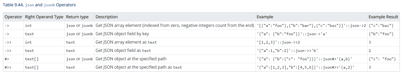
- Version 12 had 6 columns, version 13 has one.
- Could we have fewer columns? What if we had 3 columns: One for operator or function, one for the details and description, and one for an example with the results.
- We could fix (or remove) the zoom that makes the text unreadable when the page is resized.
- The new approach uses just a small part of the screen width, when we really need to use more.
Niels
-----Original Message-----
From: Bruce Momjian <bruce@momjian.us>
Sent: Tuesday, September 29, 2020 08:16
To: Tom Lane <tgl@sss.pgh.pa.us>
Cc: Niels Andersen <niels@thinkiq.com>; pgsql-docs@lists.postgresql.org
Subject: Re: Version 13 documentation layout is harder to read than version 12
On Tue, Sep 29, 2020 at 09:52:31AM -0400, Tom Lane wrote:
> PG Doc comments form <noreply@postgresql.org> writes:
> > Compare:
> > * https://www.postgresql.org/docs/13/functions-json.html
> > * https://www.postgresql.org/docs/12/functions-json.html
>
> > I know it is just my opinion, but the version 12 layout is easier to
> > read than version 13.
>
> IMO, table 9.47 (JSON Processing Functions) is pretty much the poster
> child for why we had to redesign the table layout. In the old layout,
> it's close to unreadable in any normal-size browser window, despite
> wasting lots of whitespace and having large amounts of important info
> shuffled off into "Note" blocks. The new layout is far more adaptable
> to viewing windows that aren't full-screen-width; and the "Note" text
> has all been merged into the table, so that you don't have to scroll
> down and back to find all the info about a function.
>
> I'll concede that it's a bit of a shock at first if you are used to
> the old layout. But the developer community has been looking at this
> format for six months or so now, and I think people grew accustomed to
> it fairly quickly.
I think the issue is that the PG 12 format is easier to scan a single column, while the PG 13 format is easier to read.
--
Bruce Momjian <bruce@momjian.us> https://momjian.us
EnterpriseDB https://enterprisedb.com
The usefulness of a cup is in its emptiness, Bruce Lee
Вложения
Niels Andersen <niels@thinkiq.com> writes:
>   2.  Is there a middle ground?
>      *   Version 12 had 6 columns, version 13 has one.
>      *   Could we have fewer columns? What if we had 3 columns: One for operator or function, one for the details and
description,and one for an example with the results.

A lot of these tables *did* have three columns before.  They were still too
wide.  See e.g. "Table 9.88 Replication SQL Functions" in the v12 docs.

Moreover, in a lot of places functions were just ridiculously
under-documented because of the tiny amount of space available.
If you compare v12 and v13 closely you'll notice that there's more
text for many functions (9.35 Geometric Operators is a handy example);
and there's room to add more now, wherever we need to.

Note that another reason for making these changes was so that the
tables would render in a less-than-completely-unreadable fashion in PDF
output, which is a good deal narrower than what most people use for
web browser windows (and a good deal less forgiving of overruns, too).
But I think it's a net benefit for HTML output as well, in that the
output does adapt much better than before to smaller window sizes.
Not everybody wants to dedicate their whole screen to Postgres docs.

Anyway, a very large amount of effort went into this redesign this
past spring, and we already tried a lot of variants, and already went
through the predictable complaints within the developer community.
I'm disinclined to redesign it again right now.  If people are still
unhappy in a year or so, maybe there will be some appetite for a revisit.

            regards, tom lane
On 9/29/20 3:00 PM, Tom Lane wrote:
> Niels Andersen <niels@thinkiq.com> writes:
>> 2. Is there a middle ground?
>> * Version 12 had 6 columns, version 13 has one.
>> * Could we have fewer columns? What if we had 3 columns: One for operator or function, one for the details
anddescription, and one for an example with the results.
>
> A lot of these tables *did* have three columns before. They were still too
> wide. See e.g. "Table 9.88 Replication SQL Functions" in the v12 docs.
>
> Moreover, in a lot of places functions were just ridiculously
> under-documented because of the tiny amount of space available.
> If you compare v12 and v13 closely you'll notice that there's more
> text for many functions (9.35 Geometric Operators is a handy example);
> and there's room to add more now, wherever we need to.
>
> Note that another reason for making these changes was so that the
> tables would render in a less-than-completely-unreadable fashion in PDF
> output, which is a good deal narrower than what most people use for
> web browser windows (and a good deal less forgiving of overruns, too).
> But I think it's a net benefit for HTML output as well, in that the
> output does adapt much better than before to smaller window sizes.
> Not everybody wants to dedicate their whole screen to Postgres docs.
I'll also note it helps on mobile viewing as well. We (likely the royal
"we" in this case) still need to figure out some things with the font
size on mobile to make it a bit easier to read, but the measurable
readability of the tables in the v13 docs is better than v12 on smaller
browsing windows.
> Anyway, a very large amount of effort went into this redesign this
> past spring, and we already tried a lot of variants, and already went
> through the predictable complaints within the developer community.
> I'm disinclined to redesign it again right now. If people are still
> unhappy in a year or so, maybe there will be some appetite for a revisit.
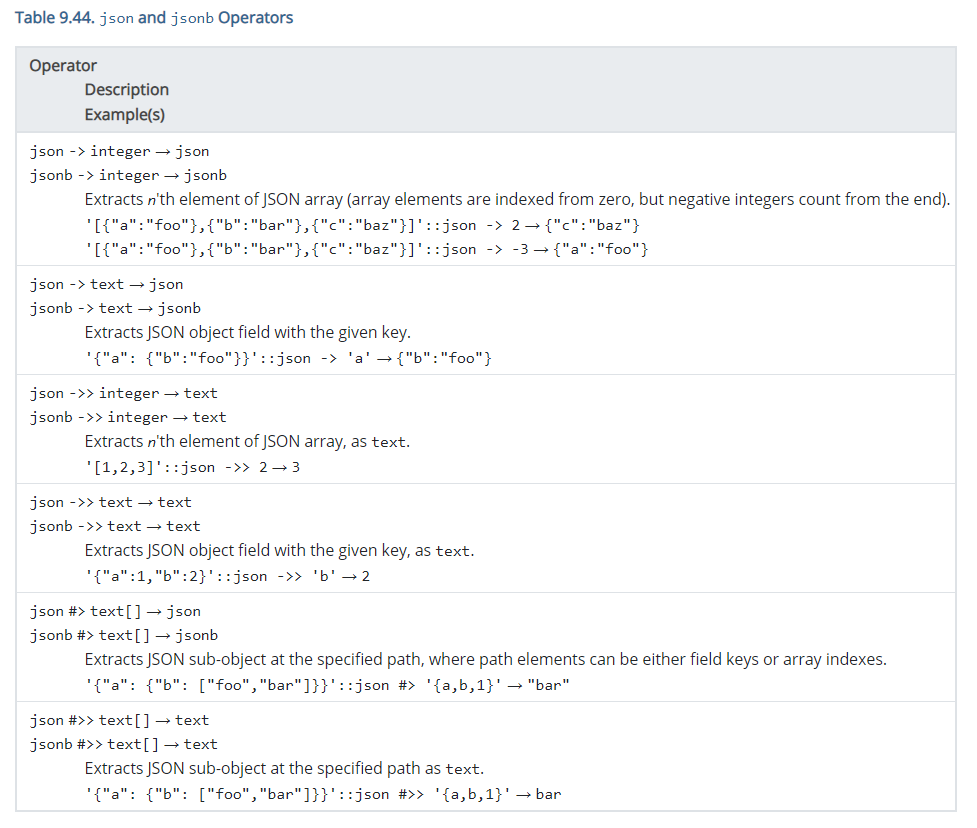
I would say on this particular page, the only thing I find slightly
confusing is when the "->" operator is being described ("json -> integer
-> json"), but I think that may just be an unfortunate happenstance and
not grounds for redesign, at least at this time.
In recent times (which likely extends to the before times), I've found
when we've rolled out any UI/UX changes across pgweb properties there is
a mix of love/hate that is based on personal preference, which may or
may not coincide with what the overall goal of the change was.
If there is something that in a defined way is hampering usability, then
we should address it, but otherwise, per Tom's analysis, I would let
this bake a bit more and see if we want to make improvements towards the
end of the v14 development cycle.
Jonathan
Вложения
> On 29 Sep 2020, at 21:09, Jonathan S. Katz <jkatz@postgresql.org> wrote:

> If there is something that in a defined way is hampering usability, then
> we should address it,

There is the issue with screen readers which was reported in [0], but that
thread stalled.  I have it on my TODO still to try out the multi-level header
support from WAI (more info in that thread) but haven't had the time to circle
back to that yet.  If there is a problem with screen readers I expect that we
will hear about it now that 13 has shipped.

> but otherwise, per Tom's analysis, I would let
> this bake a bit more and see if we want to make improvements towards the
> end of the v14 development cycle.

+1.  I for one prefer the new format, especially that it fits more information.

cheers ./daniel

[0] TYAPR01MB29903E05D5A084F1B274C8B4FE9C0@TYAPR01MB2990.jpnprd01.prod.outlook.com
"Jonathan S. Katz" <jkatz@postgresql.org> writes:
> On 9/29/20 3:00 PM, Tom Lane wrote:
>> But I think it's a net benefit for HTML output as well, in that the
>> output does adapt much better than before to smaller window sizes.
>> Not everybody wants to dedicate their whole screen to Postgres docs.

> I'll also note it helps on mobile viewing as well. We (likely the royal
> "we" in this case) still need to figure out some things with the font
> size on mobile to make it a bit easier to read, but the measurable
> readability of the tables in the v13 docs is better than v12 on smaller
> browsing windows.

See also Pavel's upthread complaint that the regular and monospace fonts
look too much alike.  Personally I'm okay with the existing choices ---
they look enough different to me, on my browser.  But I'll agree that it's
on the edge of being a problem.  It might be worth taking another look at
that whenever someone does font fiddling.

> I would say on this particular page, the only thing I find slightly
> confusing is when the "->" operator is being described ("json -> integer
> -> json"), but I think that may just be an unfortunate happenstance and
> not grounds for redesign, at least at this time.

Yeah ... again, that's somewhat down to the font choices, IMO.  The
rightarrow symbol is visibly different from ASCII "->", but not by
all that much.  I'd prefer a bigger/thicker arrow for that, but
as far as I recall we couldn't find a portable way to render one.

            regards, tom lane