Обсуждение: Mailing list archives – design ideas
Hi there,
Recently, Oleg Bartunov got quite a lot of likes and attention on a tweet[1] which asked whether we should create a better interface for the mailing list archives.
I was unsure if he meant the look and feel, the functionality, or both, but I thought it wouldn't hurt to have a think about both. I am a user of the mailing lists and also do a bit of design work, so thought I might be able to help.
After a brief discussion on Twitter[1] and in a Google doc[2], I was encouraged to email this list to get more people's thoughts and gauge interest in the ideas.
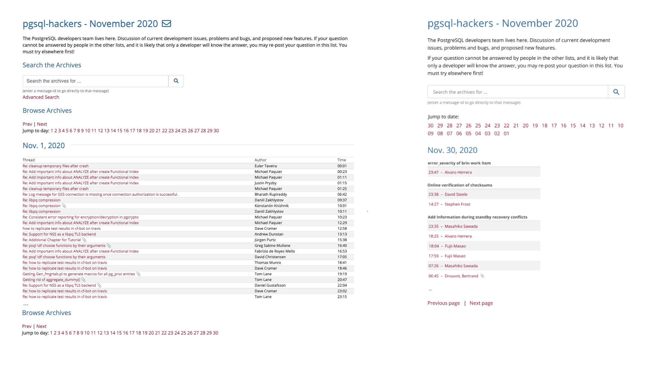
In short, the bigger ideas I tried were:
1) Reversed the chronology, to start each view with the recent emails
2) Grouped by thread (per day)
3) Considered narrower screens
3) Considered narrower screens
I've attached a screenshot with an example of the current vs these ideas, and there is more detail and thinking in the Google doc[2]. These designs were done in Figma, rather than HTML.
A question of what to do with threads across days/months has come up twice already, but I think limiting the grouping per day avoids that issue, whilst not making anything worse. I also have ideas for a better (new) view for each thread, but haven't mocked that up yet.
Looking forward to hearing what people think.
Cheers,
Michael
Вложения
On 12/14/20 9:21 AM, Michael Christofides wrote:
> Hi there,
>
> Recently, Oleg Bartunov got quite a lot of likes and attention on a
> tweet[1] which asked whether we should create a better interface for the
> mailing list archives.
>
> I was unsure if he meant the look and feel, the functionality, or both,
> but I thought it wouldn't hurt to have a think about both. I am a user
> of the mailing lists and also do a bit of design work, so thought I
> might be able to help.
>
> After a brief discussion on Twitter[1] and in a Google doc[2], I was
> encouraged to email this list to get more people's thoughts and
> gauge interest in the ideas.
>
> In short, the bigger ideas I tried were:
> 1) Reversed the chronology, to start each view with the recent emails
> 2) Grouped by thread (per day)
> 3) Considered narrower screens
>
> I've attached a screenshot with an example of the current vs these
> ideas, and there is more detail and thinking in the Google doc[2]. These
> designs were done in Figma, rather than HTML.
>
> A question of what to do with threads across days/months has come up
> twice already, but I think limiting the grouping per day avoids that
> issue, whilst not making anything worse. I also have ideas for a better
> (new) view for each thread, but haven't mocked that up yet.
>
> Looking forward to hearing what people think.

What I think:

1) We discourage top posting to keep threads from being in reverse
order, so I'm seeing this as a no go as it gets right back to inverted
flow.

2) In any message you can retrieve a thread. You can also navigate to
any message in the thread. Again a no go.

3) If people hobble themselves by trying to do computer work with a
smartphone that is their choice but it should not impact those of us
that realize the futility of that. Now if you want to do something that
kicks out to a site that is for mobile users, fine. Just leave the
current site alone.

>
> Cheers,
> Michael
>
> [1]: https://twitter.com/obartunov/status/1331259617461096451
> <https://twitter.com/obartunov/status/1331259617461096451>
> [2]:
> https://docs.google.com/document/d/1JEWU-zvtt1O-EWKYXUiSb90yKDVVNxDsjAtG-d3rV7E/edit#
> <https://docs.google.com/document/d/1JEWU-zvtt1O-EWKYXUiSb90yKDVVNxDsjAtG-d3rV7E/edit#>


--
Adrian Klaver
adrian.klaver@aklaver.com
On Mon, Dec 14, 2020 at 9:33 AM Michael Christofides
<michael@pgmustard.com> wrote:
> In short, the bigger ideas I tried were:
> 1) Reversed the chronology, to start each view with the recent emails

This probably makes sense. For the current month, I am almost always
initially looking for the latest messages. For previous months, I
suspect it doesn't really matter. We already have a
reverse-chronological listing in
https://www.postgresql.org/list/pgsql-hackers/ -- it's reasonable to
do that day-by-day as well. For what it's worth, I don't think the
analogy to top-posting holds--it's a different situation, just that
both happen to involve e-mail and time.

> 2) Grouped by thread (per day)

This is great--it makes it much easier to scan list activity. I do
think there's a bit too much padding in the mock-ups--it looks like
the same archive content would take up a lot more vertical space,
which may not be a good trade-off. The thread titles also sort of fade
into the background with the current styling--I think they could be
more prominent.

> 3) Considered narrower screens

This is nice, but you end up with a lot of empty space on wider
screens. I don't think it really makes sense to have separate columns
here, though. Do you think there's another use of this space that
could work well? If we have a layout that works well on smaller
viewports without compromising the information available on larger
viewports, that seems like a clear improvement.

> A question of what to do with threads across days/months has come up twice already, but I think limiting the grouping
perday avoids that issue, whilst not making anything worse.


This seems like a good compromise.
On Mon, Dec 14, 2020 at 9:29 PM Adrian Klaver <adrian.klaver@aklaver.com> wrote:
>
> On 12/14/20 9:21 AM, Michael Christofides wrote:
> > Hi there,
> >
> > Recently, Oleg Bartunov got quite a lot of likes and attention on a
> > tweet[1] which asked whether we should create a better interface for the
> > mailing list archives.
> >
> > I was unsure if he meant the look and feel, the functionality, or both,
> > but I thought it wouldn't hurt to have a think about both. I am a user
> > of the mailing lists and also do a bit of design work, so thought I
> > might be able to help.
> >
> > After a brief discussion on Twitter[1] and in a Google doc[2], I was
> > encouraged to email this list to get more people's thoughts and
> > gauge interest in the ideas.
> >
> > In short, the bigger ideas I tried were:
> > 1) Reversed the chronology, to start each view with the recent emails
> > 2) Grouped by thread (per day)
> > 3) Considered narrower screens
> >
> > I've attached a screenshot with an example of the current vs these
> > ideas, and there is more detail and thinking in the Google doc[2]. These
> > designs were done in Figma, rather than HTML.
> >
> > A question of what to do with threads across days/months has come up
> > twice already, but I think limiting the grouping per day avoids that
> > issue, whilst not making anything worse. I also have ideas for a better
> > (new) view for each thread, but haven't mocked that up yet.
> >
> > Looking forward to hearing what people think.

First of all - thanks for working on this! There's definitely
improvements to be done in this area.


> What I think:
>
> 1) We discourage top posting to keep threads from being in reverse
> order, so I'm seeing this as a no go as it gets right back to inverted
> flow.
>
> 2) In any message you can retrieve a thread. You can also navigate to
> any message in the thread. Again a no go.

If we go with a group by thread views, it makes sense to have two
separate views, one by thread and one by pure date. That's what a lot
of other archive software does (e.g. the one that comes with mailman,
that a lot of people are used to).

I think switching completely over to a thread based view would be bad,
but adding it as a secondary way of viewing things would be useful.


> 3) If people hobble themselves by trying to do computer work with a
> smartphone that is their choice but it should not impact those of us
> that realize the futility of that. Now if you want to do something that
> kicks out to a site that is for mobile users, fine. Just leave the
> current site alone.

So for the record, the current site is also terrible if you
accidentally maximize your browser on a 4K screen for example, so it's
definitely not *just* a problem on a smartphone.

And I can definitely see a lot of usecases for browsing the archives
on a smartphone as well as on a computer. I certainly do it myself.
Fewer times now in pandemic times which leaves me at home all the time
and in front of a computer when I need to, but still not zero.

I think claiming that reading email is a computers work and shuoldn't
be done on a smartphone is actively counterproductive.

Now, we should definitely not go for a design that's just for
smartphones. Arguably we should also not go for one that is primarily
for smartphones. But the current one is *terrible* on smartphones, and
we should make it not terrible. It should of course not be done at the
expense of access from computers, but what we have now isn't
particularly great there either. I'm sure we can find a way to make it
a big improvement on small devices and a small improvement on big
devices, compared to what we have now.

--
 Magnus Hagander
 Me: https://www.hagander.net/
 Work: https://www.redpill-linpro.com/
On 12/15/20 8:15 AM, Magnus Hagander wrote:
> On Mon, Dec 14, 2020 at 9:29 PM Adrian Klaver <adrian.klaver@aklaver.com> wrote:
>>
>> On 12/14/20 9:21 AM, Michael Christofides wrote:
>>> Hi there,

> Now, we should definitely not go for a design that's just for
> smartphones. Arguably we should also not go for one that is primarily
> for smartphones. But the current one is *terrible* on smartphones, and
> we should make it not terrible. It should of course not be done at the
> expense of access from computers, but what we have now isn't
> particularly great there either. I'm sure we can find a way to make it
> a big improvement on small devices and a small improvement on big
> devices, compared to what we have now.

Is it possible to do what Wikipedia does?:

Computers:
en.wikipedia.org

Mobile:
en.m.wikipedia.org


--
Adrian Klaver
adrian.klaver@aklaver.com
On 12/15/20 5:54 PM, Adrian Klaver wrote:
> On 12/15/20 8:15 AM, Magnus Hagander wrote:
>> On Mon, Dec 14, 2020 at 9:29 PM Adrian Klaver
>> <adrian.klaver@aklaver.com> wrote:
>>>
>>> On 12/14/20 9:21 AM, Michael Christofides wrote:
>>>> Hi there,
>
>> Now, we should definitely not go for a design that's just for
>> smartphones. Arguably we should also not go for one that is primarily
>> for smartphones. But the current one is *terrible* on smartphones, and
>> we should make it not terrible. It should of course not be done at the
>> expense of access from computers, but what we have now isn't
>> particularly great there either. I'm sure we can find a way to make it
>> a big improvement on small devices and a small improvement on big
>> devices, compared to what we have now.
>
> Is it possible to do what Wikipedia does?:
>
> Computers:
> en.wikipedia.org
>
> Mobile:
> en.m.wikipedia.org


It is possible, but we should not do this.  There should be one site and
one html.  Then media queries in the css can decide how to display it
for desktops, mobile, printers, and more.  No javascript required, either.
--
Vik Fearing
On 16/12/2020 01:23, Vik Fearing wrote:
> On 12/15/20 5:54 PM, Adrian Klaver wrote:
>> On 12/15/20 8:15 AM, Magnus Hagander wrote:
>>> On Mon, Dec 14, 2020 at 9:29 PM Adrian Klaver
>>> <adrian.klaver@aklaver.com> wrote:
>>>> On 12/14/20 9:21 AM, Michael Christofides wrote:
>>>>> Hi there,
>>> Now, we should definitely not go for a design that's just for
>>> smartphones. Arguably we should also not go for one that is primarily
>>> for smartphones. But the current one is *terrible* on smartphones, and
>>> we should make it not terrible. It should of course not be done at the
>>> expense of access from computers, but what we have now isn't
>>> particularly great there either. I'm sure we can find a way to make it
>>> a big improvement on small devices and a small improvement on big
>>> devices, compared to what we have now.
>> Is it possible to do what Wikipedia does?:
>>
>> Computers:
>> en.wikipedia.org
>>
>> Mobile:
>> en.m.wikipedia.org
>
> It is possible, but we should not do this.  There should be one site and
> one html.  Then media queries in the css can decide how to display it
> for desktops, mobile, printers, and more.  No javascript required, either.

Agreed, this can work without any JS, or duplicating the content.

This discussion got stuck somehow, what is needed to implement one or
all of the proposals?


Thanks,

--
                Andreas 'ads' Scherbaum
German PostgreSQL User Group
European PostgreSQL User Group - Board of Directors
Volunteer Regional Contact, Germany - PostgreSQL Project
> This discussion got stuck somehow, what is needed to implement one or
> all of the proposals?

Thanks all. I suspect it's my fault this got stuck, sorry for the radio silence.

The general feedback seems to be:

1) Reversed chronology – generally liked
2) Grouped by thread – needs more thought
3) Considered narrower screens – needs more thought

The changes for the reversed chronology could be valuable alone, and I
can have a go at redesigns for the other two (factoring in the things
people raised).

Would the reversed chronology changes only need to include the following?

a) month views changed to descending order
b) jump to day/date lists being switched to descending order
c) prev / next adapted to work with new ordering

Cheers,
Michael