Hi there,
Recently, Oleg Bartunov got quite a lot of likes and attention on a tweet[1] which asked whether we should create a better interface for the mailing list archives.
I was unsure if he meant the look and feel, the functionality, or both, but I thought it wouldn't hurt to have a think about both. I am a user of the mailing lists and also do a bit of design work, so thought I might be able to help.
After a brief discussion on Twitter[1] and in a Google doc[2], I was encouraged to email this list to get more people's thoughts and gauge interest in the ideas.
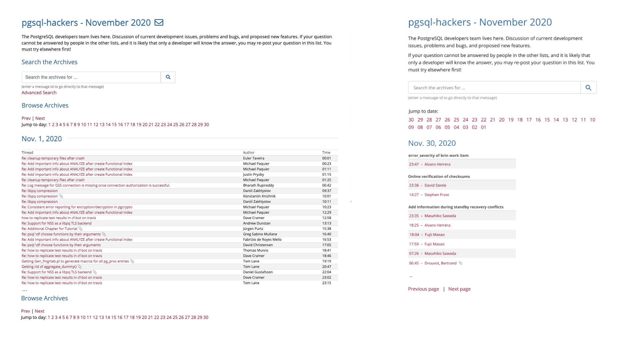
In short, the bigger ideas I tried were:
1) Reversed the chronology, to start each view with the recent emails
2) Grouped by thread (per day)
3) Considered narrower screens
I've attached a screenshot with an example of the current vs these ideas, and there is more detail and thinking in the Google doc[2]. These designs were done in Figma, rather than HTML.
A question of what to do with threads across days/months has come up twice already, but I think limiting the grouping per day avoids that issue, whilst not making anything worse. I also have ideas for a better (new) view for each thread, but haven't mocked that up yet.
Looking forward to hearing what people think.
Cheers,
Michael