Обсуждение: PATCH: Table header size
Hi Dave/Team,


As my offline conversation with Chethana, we need better look 'n' feel for the table header row.
And - as per his proposal I've modified the table header row to look different from rest of the rows.
Please find the attached patch for the same.
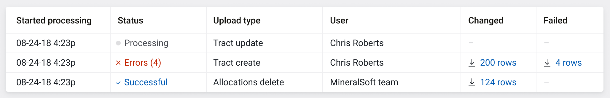
Let me share the screen shot for the now, and proposed change.
Now:
Proposed:
Please let me know your thoughts.
Вложения
Hi Dave/Team,
Just explain it -
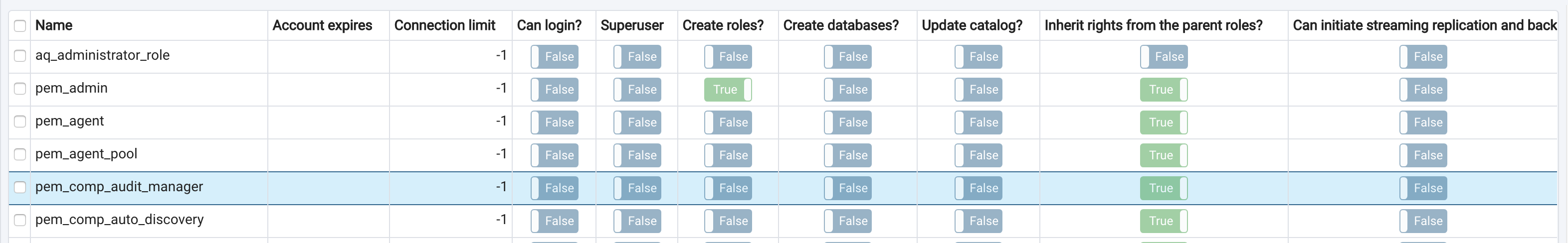
Change - Increased the padding for 'th' (table header)
Reason - The table header is not getting highlighted enough thus the sense of hierarchy and visual difference between 'th' and 'td' is not strong enough
Case study -
If you see the existing version of table everything looks flat in terms of hierarchy due to 'white background' for both 'th' and 'td' except the header texts are in bold.
I would recommend you to see it in the actual application for better clarity of the issue.
Conclusion -
Padding does that required differentiation part in order to highlight/achieve the hierarchy.
Attaching the reference design too and going further I am aiming to reach this level of look and feel with our application.
I really feel that "a good amount of breathing space sets the user's mind calm and focused towards reading the data" :)

---
Chethana kumar
On Fri, Feb 8, 2019 at 10:34 AM Ashesh Vashi <ashesh.vashi@enterprisedb.com> wrote:
Hi Dave/Team,As my offline conversation with Chethana, we need better look 'n' feel for the table header row.And - as per his proposal I've modified the table header row to look different from rest of the rows.Please find the attached patch for the same.Let me share the screen shot for the now, and proposed change.Now:Proposed:Please let me know your thoughts.


Chethana Kumar
Principal UI/UX Designer
EnterpriseDB Corporation

The Postgres Database Company
P: +91 86981 57146
Вложения
Hi
Can we adjust the top/bottom padding, but leave the left/right? By modifying the left/right padding, we cause the data to become offset with the header.
Otherwise I'm cool with the change.
On Fri, Feb 8, 2019 at 6:40 AM Chethana Kumar <chethana.kumar@enterprisedb.com> wrote:
Hi Dave/Team,Just explain it -Change - Increased the padding for 'th' (table header)Reason - The table header is not getting highlighted enough thus the sense of hierarchy and visual difference between 'th' and 'td' is not strong enoughCase study -If you see the existing version of table everything looks flat in terms of hierarchy due to 'white background' for both 'th' and 'td' except the header texts are in bold.I would recommend you to see it in the actual application for better clarity of the issue.Conclusion -Padding does that required differentiation part in order to highlight/achieve the hierarchy.Attaching the reference design too and going further I am aiming to reach this level of look and feel with our application.I really feel that "a good amount of breathing space sets the user's mind calm and focused towards reading the data" :)---Chethana kumarOn Fri, Feb 8, 2019 at 10:34 AM Ashesh Vashi <ashesh.vashi@enterprisedb.com> wrote:Hi Dave/Team,As my offline conversation with Chethana, we need better look 'n' feel for the table header row.And - as per his proposal I've modified the table header row to look different from rest of the rows.Please find the attached patch for the same.Let me share the screen shot for the now, and proposed change.Now:Proposed:Please let me know your thoughts.--Chethana KumarPrincipal UI/UX DesignerEnterpriseDB CorporationThe Postgres Database CompanyP: +91 86981 57146


Dave Page
Blog: http://pgsnake.blogspot.com
Twitter: @pgsnake
EnterpriseDB UK: http://www.enterprisedb.com
The Enterprise PostgreSQL Company
Blog: http://pgsnake.blogspot.com
Twitter: @pgsnake
EnterpriseDB UK: http://www.enterprisedb.com
The Enterprise PostgreSQL Company
Вложения
Yes Dave, I am agree with you!
But some default padding is required for left and right.
For example- 8px 5px 8px 5px; (top, right, bottom, left)
This combination will get you similar look and feel of output same as my reference design.

---
Chethana kumar
On Fri, Feb 8, 2019 at 2:56 PM Dave Page <dpage@pgadmin.org> wrote:
HiCan we adjust the top/bottom padding, but leave the left/right? By modifying the left/right padding, we cause the data to become offset with the header.Otherwise I'm cool with the change.On Fri, Feb 8, 2019 at 6:40 AM Chethana Kumar <chethana.kumar@enterprisedb.com> wrote:Hi Dave/Team,Just explain it -Change - Increased the padding for 'th' (table header)Reason - The table header is not getting highlighted enough thus the sense of hierarchy and visual difference between 'th' and 'td' is not strong enoughCase study -If you see the existing version of table everything looks flat in terms of hierarchy due to 'white background' for both 'th' and 'td' except the header texts are in bold.I would recommend you to see it in the actual application for better clarity of the issue.Conclusion -Padding does that required differentiation part in order to highlight/achieve the hierarchy.Attaching the reference design too and going further I am aiming to reach this level of look and feel with our application.I really feel that "a good amount of breathing space sets the user's mind calm and focused towards reading the data" :)---Chethana kumarOn Fri, Feb 8, 2019 at 10:34 AM Ashesh Vashi <ashesh.vashi@enterprisedb.com> wrote:Hi Dave/Team,As my offline conversation with Chethana, we need better look 'n' feel for the table header row.And - as per his proposal I've modified the table header row to look different from rest of the rows.Please find the attached patch for the same.Let me share the screen shot for the now, and proposed change.Now:Proposed:Please let me know your thoughts.--Chethana KumarPrincipal UI/UX DesignerEnterpriseDB CorporationThe Postgres Database CompanyP: +91 86981 57146--Dave Page
Blog: http://pgsnake.blogspot.com
Twitter: @pgsnake
EnterpriseDB UK: http://www.enterprisedb.com
The Enterprise PostgreSQL Company

Chethana Kumar
Principal UI/UX Designer
EnterpriseDB Corporation
The Postgres Database Company
P: +91 86981 57146
Вложения
On Fri, Feb 8, 2019 at 7:28 PM Chethana Kumar <chethana.kumar@enterprisedb.com> wrote:
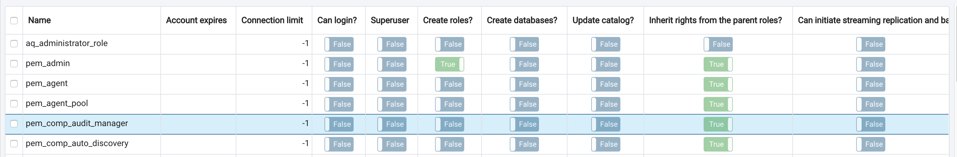
Yes Dave, I am agree with you!But some default padding is required for left and right.For example- 8px 5px 8px 5px; (top, right, bottom, left)This combination will get you similar look and feel of output same as my reference design.

@Chethana Kumar - he is not saying, we should not have left, and right padding.
He means to say - only set the top, and bottom padding, and that way - we would always have consistent left, and right padding (which will be inherited from the bootstrap CSS).
@Dave - please find the updated patch.
-- Thanks, Ashesh
---Chethana kumarOn Fri, Feb 8, 2019 at 2:56 PM Dave Page <dpage@pgadmin.org> wrote:HiCan we adjust the top/bottom padding, but leave the left/right? By modifying the left/right padding, we cause the data to become offset with the header.Otherwise I'm cool with the change.On Fri, Feb 8, 2019 at 6:40 AM Chethana Kumar <chethana.kumar@enterprisedb.com> wrote:Hi Dave/Team,Just explain it -Change - Increased the padding for 'th' (table header)Reason - The table header is not getting highlighted enough thus the sense of hierarchy and visual difference between 'th' and 'td' is not strong enoughCase study -If you see the existing version of table everything looks flat in terms of hierarchy due to 'white background' for both 'th' and 'td' except the header texts are in bold.I would recommend you to see it in the actual application for better clarity of the issue.Conclusion -Padding does that required differentiation part in order to highlight/achieve the hierarchy.Attaching the reference design too and going further I am aiming to reach this level of look and feel with our application.I really feel that "a good amount of breathing space sets the user's mind calm and focused towards reading the data" :)---Chethana kumarOn Fri, Feb 8, 2019 at 10:34 AM Ashesh Vashi <ashesh.vashi@enterprisedb.com> wrote:Hi Dave/Team,As my offline conversation with Chethana, we need better look 'n' feel for the table header row.And - as per his proposal I've modified the table header row to look different from rest of the rows.Please find the attached patch for the same.Let me share the screen shot for the now, and proposed change.Now:Proposed:Please let me know your thoughts.--Chethana KumarPrincipal UI/UX DesignerEnterpriseDB CorporationThe Postgres Database CompanyP: +91 86981 57146--Dave Page
Blog: http://pgsnake.blogspot.com
Twitter: @pgsnake
EnterpriseDB UK: http://www.enterprisedb.com
The Enterprise PostgreSQL Company--Chethana KumarPrincipal UI/UX DesignerEnterpriseDB CorporationThe Postgres Database CompanyP: +91 86981 57146

Вложения
Ashesh,
On Mon, Feb 11, 2019 at 11:51 AM Ashesh Vashi <ashesh.vashi@enterprisedb.com> wrote:
On Fri, Feb 8, 2019 at 7:28 PM Chethana Kumar <chethana.kumar@enterprisedb.com> wrote:Yes Dave, I am agree with you!But some default padding is required for left and right.For example- 8px 5px 8px 5px; (top, right, bottom, left)This combination will get you similar look and feel of output same as my reference design.@Chethana Kumar - he is not saying, we should not have left, and right padding.He means to say - only set the top, and bottom padding, and that way - we would always have consistent left, and right padding (which will be inherited from the bootstrap CSS).

Yes I did get that point but what I was trying to say that the left and right padding should have certain proportionate values with the top and bottom then only it looks visually appealing.
Ultimately, The padding should be given by a calculative way but not a random way. Hope you got my concern here.
---
Chethana kumar
@Dave - please find the updated patch.-- Thanks, Ashesh---Chethana kumarOn Fri, Feb 8, 2019 at 2:56 PM Dave Page <dpage@pgadmin.org> wrote:HiCan we adjust the top/bottom padding, but leave the left/right? By modifying the left/right padding, we cause the data to become offset with the header.Otherwise I'm cool with the change.On Fri, Feb 8, 2019 at 6:40 AM Chethana Kumar <chethana.kumar@enterprisedb.com> wrote:Hi Dave/Team,Just explain it -Change - Increased the padding for 'th' (table header)Reason - The table header is not getting highlighted enough thus the sense of hierarchy and visual difference between 'th' and 'td' is not strong enoughCase study -If you see the existing version of table everything looks flat in terms of hierarchy due to 'white background' for both 'th' and 'td' except the header texts are in bold.I would recommend you to see it in the actual application for better clarity of the issue.Conclusion -Padding does that required differentiation part in order to highlight/achieve the hierarchy.Attaching the reference design too and going further I am aiming to reach this level of look and feel with our application.I really feel that "a good amount of breathing space sets the user's mind calm and focused towards reading the data" :)---Chethana kumarOn Fri, Feb 8, 2019 at 10:34 AM Ashesh Vashi <ashesh.vashi@enterprisedb.com> wrote:Hi Dave/Team,As my offline conversation with Chethana, we need better look 'n' feel for the table header row.And - as per his proposal I've modified the table header row to look different from rest of the rows.Please find the attached patch for the same.Let me share the screen shot for the now, and proposed change.Now:Proposed:Please let me know your thoughts.--Chethana KumarPrincipal UI/UX DesignerEnterpriseDB CorporationThe Postgres Database CompanyP: +91 86981 57146--Dave Page
Blog: http://pgsnake.blogspot.com
Twitter: @pgsnake
EnterpriseDB UK: http://www.enterprisedb.com
The Enterprise PostgreSQL Company--Chethana KumarPrincipal UI/UX DesignerEnterpriseDB CorporationThe Postgres Database CompanyP: +91 86981 57146


Chethana Kumar
Principal UI/UX Designer
EnterpriseDB Corporation
The Postgres Database Company
P: +91 86981 57146
Вложения
On Mon, Feb 11, 2019 at 12:18 PM Chethana Kumar <chethana.kumar@enterprisedb.com> wrote:
Ashesh,On Mon, Feb 11, 2019 at 11:51 AM Ashesh Vashi <ashesh.vashi@enterprisedb.com> wrote:On Fri, Feb 8, 2019 at 7:28 PM Chethana Kumar <chethana.kumar@enterprisedb.com> wrote:Yes Dave, I am agree with you!But some default padding is required for left and right.For example- 8px 5px 8px 5px; (top, right, bottom, left)This combination will get you similar look and feel of output same as my reference design.@Chethana Kumar - he is not saying, we should not have left, and right padding.He means to say - only set the top, and bottom padding, and that way - we would always have consistent left, and right padding (which will be inherited from the bootstrap CSS).Yes I did get that point but what I was trying to say that the left and right padding should have certain proportionate values with the top and bottom then only it looks visually appealing.Ultimately, The padding should be given by a calculative way but not a random way. Hope you got my concern here.

It's not some random value.
We can't have left/right padding different for headers, and body cell.
It must be matching.
So - the option we have is to increase the left/right padding for body cells (td) as well.
-- Thanks, Ashesh
---Chethana kumar@Dave - please find the updated patch.-- Thanks, Ashesh---Chethana kumarOn Fri, Feb 8, 2019 at 2:56 PM Dave Page <dpage@pgadmin.org> wrote:HiCan we adjust the top/bottom padding, but leave the left/right? By modifying the left/right padding, we cause the data to become offset with the header.Otherwise I'm cool with the change.On Fri, Feb 8, 2019 at 6:40 AM Chethana Kumar <chethana.kumar@enterprisedb.com> wrote:Hi Dave/Team,Just explain it -Change - Increased the padding for 'th' (table header)Reason - The table header is not getting highlighted enough thus the sense of hierarchy and visual difference between 'th' and 'td' is not strong enoughCase study -If you see the existing version of table everything looks flat in terms of hierarchy due to 'white background' for both 'th' and 'td' except the header texts are in bold.I would recommend you to see it in the actual application for better clarity of the issue.Conclusion -Padding does that required differentiation part in order to highlight/achieve the hierarchy.Attaching the reference design too and going further I am aiming to reach this level of look and feel with our application.I really feel that "a good amount of breathing space sets the user's mind calm and focused towards reading the data" :)---Chethana kumarOn Fri, Feb 8, 2019 at 10:34 AM Ashesh Vashi <ashesh.vashi@enterprisedb.com> wrote:Hi Dave/Team,As my offline conversation with Chethana, we need better look 'n' feel for the table header row.And - as per his proposal I've modified the table header row to look different from rest of the rows.Please find the attached patch for the same.Let me share the screen shot for the now, and proposed change.Now:Proposed:Please let me know your thoughts.--Chethana KumarPrincipal UI/UX DesignerEnterpriseDB CorporationThe Postgres Database CompanyP: +91 86981 57146--Dave Page
Blog: http://pgsnake.blogspot.com
Twitter: @pgsnake
EnterpriseDB UK: http://www.enterprisedb.com
The Enterprise PostgreSQL Company--Chethana KumarPrincipal UI/UX DesignerEnterpriseDB CorporationThe Postgres Database CompanyP: +91 86981 57146--Chethana KumarPrincipal UI/UX DesignerEnterpriseDB CorporationThe Postgres Database CompanyP: +91 86981 57146


Вложения
On Mon, Feb 11, 2019 at 12:25 PM Ashesh Vashi <ashesh.vashi@enterprisedb.com> wrote:
On Mon, Feb 11, 2019 at 12:18 PM Chethana Kumar <chethana.kumar@enterprisedb.com> wrote:
Ashesh,On Mon, Feb 11, 2019 at 11:51 AM Ashesh Vashi <ashesh.vashi@enterprisedb.com> wrote:On Fri, Feb 8, 2019 at 7:28 PM Chethana Kumar <chethana.kumar@enterprisedb.com> wrote:Yes Dave, I am agree with you!But some default padding is required for left and right.For example- 8px 5px 8px 5px; (top, right, bottom, left)This combination will get you similar look and feel of output same as my reference design.@Chethana Kumar - he is not saying, we should not have left, and right padding.He means to say - only set the top, and bottom padding, and that way - we would always have consistent left, and right padding (which will be inherited from the bootstrap CSS).Yes I did get that point but what I was trying to say that the left and right padding should have certain proportionate values with the top and bottom then only it looks visually appealing.Ultimately, The padding should be given by a calculative way but not a random way. Hope you got my concern here.It's not some random value.

We can't have left/right padding different for headers, and body cell.It must be matching.
Yes you got it now.
--- Thanks
So - the option we have is to increase the left/right padding for body cells (td) as well.-- Thanks, Ashesh---Chethana kumar@Dave - please find the updated patch.-- Thanks, Ashesh---Chethana kumarOn Fri, Feb 8, 2019 at 2:56 PM Dave Page <dpage@pgadmin.org> wrote:HiCan we adjust the top/bottom padding, but leave the left/right? By modifying the left/right padding, we cause the data to become offset with the header.Otherwise I'm cool with the change.On Fri, Feb 8, 2019 at 6:40 AM Chethana Kumar <chethana.kumar@enterprisedb.com> wrote:Hi Dave/Team,Just explain it -Change - Increased the padding for 'th' (table header)Reason - The table header is not getting highlighted enough thus the sense of hierarchy and visual difference between 'th' and 'td' is not strong enoughCase study -If you see the existing version of table everything looks flat in terms of hierarchy due to 'white background' for both 'th' and 'td' except the header texts are in bold.I would recommend you to see it in the actual application for better clarity of the issue.Conclusion -Padding does that required differentiation part in order to highlight/achieve the hierarchy.Attaching the reference design too and going further I am aiming to reach this level of look and feel with our application.I really feel that "a good amount of breathing space sets the user's mind calm and focused towards reading the data" :)---Chethana kumarOn Fri, Feb 8, 2019 at 10:34 AM Ashesh Vashi <ashesh.vashi@enterprisedb.com> wrote:Hi Dave/Team,As my offline conversation with Chethana, we need better look 'n' feel for the table header row.And - as per his proposal I've modified the table header row to look different from rest of the rows.Please find the attached patch for the same.Let me share the screen shot for the now, and proposed change.Now:Proposed:Please let me know your thoughts.--Chethana KumarPrincipal UI/UX DesignerEnterpriseDB CorporationThe Postgres Database CompanyP: +91 86981 57146--Dave Page
Blog: http://pgsnake.blogspot.com
Twitter: @pgsnake
EnterpriseDB UK: http://www.enterprisedb.com
The Enterprise PostgreSQL Company--Chethana KumarPrincipal UI/UX DesignerEnterpriseDB CorporationThe Postgres Database CompanyP: +91 86981 57146--Chethana KumarPrincipal UI/UX DesignerEnterpriseDB CorporationThe Postgres Database CompanyP: +91 86981 57146


Chethana Kumar
Principal UI/UX Designer
EnterpriseDB Corporation
The Postgres Database Company
P: +91 86981 57146
Вложения
On Mon, Feb 11, 2019 at 12:31 PM Chethana Kumar <chethana.kumar@enterprisedb.com> wrote:
On Mon, Feb 11, 2019 at 12:25 PM Ashesh Vashi <ashesh.vashi@enterprisedb.com> wrote:On Mon, Feb 11, 2019 at 12:18 PM Chethana Kumar <chethana.kumar@enterprisedb.com> wrote:
Ashesh,On Mon, Feb 11, 2019 at 11:51 AM Ashesh Vashi <ashesh.vashi@enterprisedb.com> wrote:On Fri, Feb 8, 2019 at 7:28 PM Chethana Kumar <chethana.kumar@enterprisedb.com> wrote:Yes Dave, I am agree with you!But some default padding is required for left and right.For example- 8px 5px 8px 5px; (top, right, bottom, left)This combination will get you similar look and feel of output same as my reference design.@Chethana Kumar - he is not saying, we should not have left, and right padding.He means to say - only set the top, and bottom padding, and that way - we would always have consistent left, and right padding (which will be inherited from the bootstrap CSS).Yes I did get that point but what I was trying to say that the left and right padding should have certain proportionate values with the top and bottom then only it looks visually appealing.Ultimately, The padding should be given by a calculative way but not a random way. Hope you got my concern here.It's not some random value.We can't have left/right padding different for headers, and body cell.

If suppose you are moving headers (th) then without mentioning it goes that the body (td) cells will also move together to it.
All the times!
--- Thanks.
It must be matching.Yes you got it now.--- ThanksSo - the option we have is to increase the left/right padding for body cells (td) as well.-- Thanks, Ashesh---Chethana kumar@Dave - please find the updated patch.-- Thanks, Ashesh---Chethana kumarOn Fri, Feb 8, 2019 at 2:56 PM Dave Page <dpage@pgadmin.org> wrote:HiCan we adjust the top/bottom padding, but leave the left/right? By modifying the left/right padding, we cause the data to become offset with the header.Otherwise I'm cool with the change.On Fri, Feb 8, 2019 at 6:40 AM Chethana Kumar <chethana.kumar@enterprisedb.com> wrote:Hi Dave/Team,Just explain it -Change - Increased the padding for 'th' (table header)Reason - The table header is not getting highlighted enough thus the sense of hierarchy and visual difference between 'th' and 'td' is not strong enoughCase study -If you see the existing version of table everything looks flat in terms of hierarchy due to 'white background' for both 'th' and 'td' except the header texts are in bold.I would recommend you to see it in the actual application for better clarity of the issue.Conclusion -Padding does that required differentiation part in order to highlight/achieve the hierarchy.Attaching the reference design too and going further I am aiming to reach this level of look and feel with our application.I really feel that "a good amount of breathing space sets the user's mind calm and focused towards reading the data" :)---Chethana kumarOn Fri, Feb 8, 2019 at 10:34 AM Ashesh Vashi <ashesh.vashi@enterprisedb.com> wrote:Hi Dave/Team,As my offline conversation with Chethana, we need better look 'n' feel for the table header row.And - as per his proposal I've modified the table header row to look different from rest of the rows.Please find the attached patch for the same.Let me share the screen shot for the now, and proposed change.Now:Proposed:Please let me know your thoughts.--Chethana KumarPrincipal UI/UX DesignerEnterpriseDB CorporationThe Postgres Database CompanyP: +91 86981 57146--Dave Page
Blog: http://pgsnake.blogspot.com
Twitter: @pgsnake
EnterpriseDB UK: http://www.enterprisedb.com
The Enterprise PostgreSQL Company--Chethana KumarPrincipal UI/UX DesignerEnterpriseDB CorporationThe Postgres Database CompanyP: +91 86981 57146--Chethana KumarPrincipal UI/UX DesignerEnterpriseDB CorporationThe Postgres Database CompanyP: +91 86981 57146--Chethana KumarPrincipal UI/UX DesignerEnterpriseDB CorporationThe Postgres Database CompanyP: +91 86981 57146


Chethana Kumar
Principal UI/UX Designer
EnterpriseDB Corporation
The Postgres Database Company
P: +91 86981 57146
Вложения
Thanks, patch applied.

On Mon, Feb 11, 2019 at 6:21 AM Ashesh Vashi
<ashesh.vashi@enterprisedb.com> wrote:
>
> On Fri, Feb 8, 2019 at 7:28 PM Chethana Kumar <chethana.kumar@enterprisedb.com> wrote:
>>
>> Yes Dave, I am agree with you!
>>
>> But some default padding is required for left and right.
>> For example- 8px 5px 8px 5px; (top, right, bottom, left)
>> This combination will get you similar look and feel of output same as my reference design.
>>
>>
> @Chethana Kumar  - he is not saying, we should not have left, and right padding.
> He means to say - only set the top, and bottom padding, and that way - we would always have consistent left, and
rightpadding (which will be inherited from the bootstrap CSS).

>
> @Dave - please find the updated patch.
>
> -- Thanks, Ashesh
>
>>
>>
>> ---
>> Chethana kumar
>>
>> On Fri, Feb 8, 2019 at 2:56 PM Dave Page <dpage@pgadmin.org> wrote:
>>>
>>> Hi
>>>
>>> Can we adjust the top/bottom padding, but leave the left/right? By modifying the left/right padding, we cause the
datato become offset with the header.

>>>
>>> Otherwise I'm cool with the change.
>>>
>>> On Fri, Feb 8, 2019 at 6:40 AM Chethana Kumar <chethana.kumar@enterprisedb.com> wrote:
>>>>
>>>> Hi Dave/Team,
>>>>
>>>> Just explain it -
>>>>
>>>> Change - Increased the padding for 'th' (table header)
>>>>
>>>> Reason - The table header is not getting highlighted enough thus the sense of hierarchy and visual difference
between'th' and 'td' is not strong enough

>>>>
>>>> Case study -
>>>> If you see the existing version of table everything looks flat in terms of hierarchy due to 'white background' for
both'th' and 'td' except the header texts are in bold.

>>>> I would recommend you to see it in the actual application for better clarity of the issue.
>>>>
>>>> Conclusion -
>>>> Padding does that required differentiation part in order to highlight/achieve the hierarchy.
>>>>
>>>> Attaching the reference design too and going further I am aiming to reach this level of look and feel with our
application.
>>>> I really feel that "a good amount of breathing space sets the user's mind calm and focused towards reading the
data":)

>>>>
>>>>
>>>>
>>>> ---
>>>> Chethana kumar
>>>>
>>>>
>>>> On Fri, Feb 8, 2019 at 10:34 AM Ashesh Vashi <ashesh.vashi@enterprisedb.com> wrote:
>>>>>
>>>>> Hi Dave/Team,
>>>>>
>>>>> As my offline conversation with Chethana, we need better look 'n' feel for the table header row.
>>>>> And - as per his proposal I've modified the table header row to look different from rest of the rows.
>>>>>
>>>>> Please find the attached patch for the same.
>>>>>
>>>>> Let me share the screen shot for the now, and proposed change.
>>>>> Now:
>>>>>
>>>>>
>>>>> Proposed:
>>>>>
>>>>>
>>>>> Please let me know your thoughts.
>>>>>
>>>>> --
>>>>>
>>>>> Thanks & Regards,
>>>>>
>>>>> Ashesh Vashi
>>>>> EnterpriseDB INDIA: Enterprise PostgreSQL Company
>>>>>
>>>>>
>>>>> http://www.linkedin.com/in/asheshvashi
>>>>
>>>>
>>>>
>>>> --
>>>> Chethana Kumar
>>>> Principal UI/UX Designer
>>>> EnterpriseDB Corporation
>>>>
>>>>
>>>> The Postgres Database Company
>>>>
>>>> P: +91 86981 57146
>>>> www.enterprisedb.com
>>>
>>>
>>>
>>> --
>>> Dave Page
>>> Blog: http://pgsnake.blogspot.com
>>> Twitter: @pgsnake
>>>
>>> EnterpriseDB UK: http://www.enterprisedb.com
>>> The Enterprise PostgreSQL Company
>>
>>
>>
>> --
>> Chethana Kumar
>> Principal UI/UX Designer
>> EnterpriseDB Corporation
>>
>>
>> The Postgres Database Company
>>
>> P: +91 86981 57146
>> www.enterprisedb.com


--
Dave Page
Blog: http://pgsnake.blogspot.com
Twitter: @pgsnake

EnterpriseDB UK: http://www.enterprisedb.com
The Enterprise PostgreSQL Company