Hi Dave/Team,
Just explain it -
Change - Increased the padding for 'th' (table header)
Reason - The table header is not getting highlighted enough thus the sense of hierarchy and visual difference between 'th' and 'td' is not strong enough
Case study -
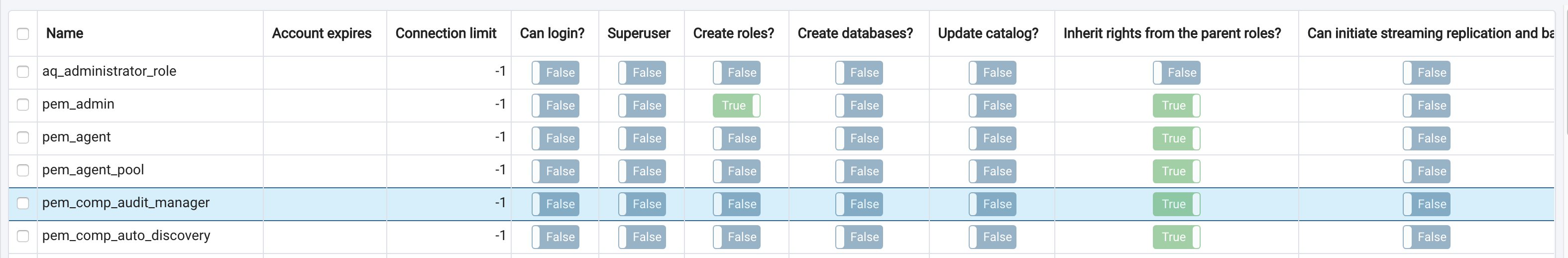
If you see the existing version of table everything looks flat in terms of hierarchy due to 'white background' for both 'th' and 'td' except the header texts are in bold.
I would recommend you to see it in the actual application for better clarity of the issue.
Conclusion -
Padding does that required differentiation part in order to highlight/achieve the hierarchy.
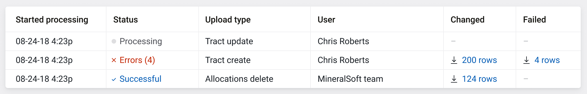
Attaching the reference design too and going further I am aiming to reach this level of look and feel with our application.
I really feel that "a good amount of breathing space sets the user's mind calm and focused towards reading the data" :)
---
Chethana kumar
Hi Dave/Team,
As my offline conversation with Chethana, we need better look 'n' feel for the table header row.
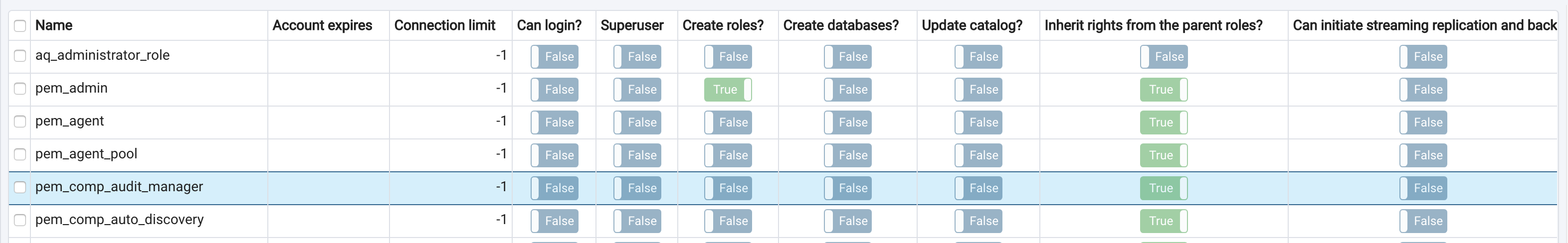
And - as per his proposal I've modified the table header row to look different from rest of the rows.
Please find the attached patch for the same.
Let me share the screen shot for the now, and proposed change.
Proposed:
Please let me know your thoughts.
--
Chethana Kumar
Principal UI/UX Designer
The Postgres Database Company
P: +91 86981 57146