But some default padding is required for left and right.
For example- 8px 5px 8px 5px; (top, right, bottom, left)
This combination will get you similar look and feel of output same as my reference design.
@Chethana Kumar - he is not saying, we should not have left, and right padding.
He means to say - only set the top, and bottom padding, and that way - we would always have consistent left, and right padding (which will be inherited from the bootstrap CSS).
Yes I did get that point but what I was trying to say that the left and right padding should have certain proportionate values with the top and bottom then only it looks visually appealing.
Ultimately, The padding should be given by a calculative way but not a random way. Hope you got my concern here.
Can we adjust the top/bottom padding, but leave the left/right? By modifying the left/right padding, we cause the data to become offset with the header.
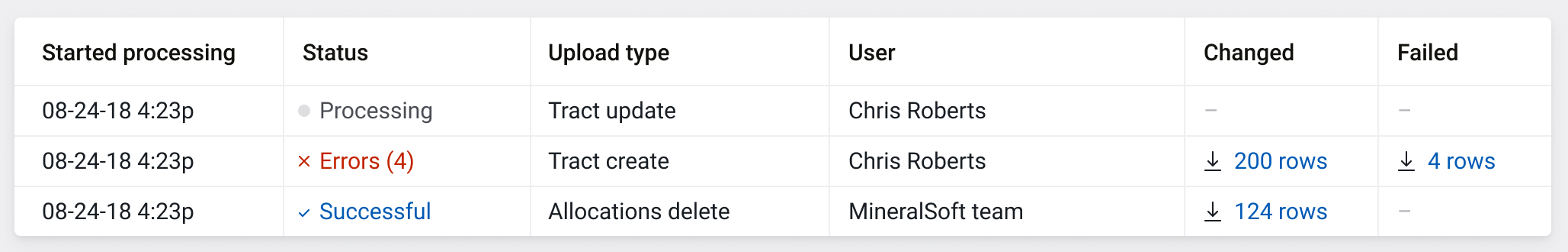
Change - Increased the padding for 'th' (table header)
Reason - The table header is not getting highlighted enough thus the sense of hierarchy and visual difference between 'th' and 'td' is not strong enough
Case study -
If you see the existing version of table everything looks flat in terms of hierarchy due to 'white background' for both 'th' and 'td' except the header texts are in bold.
I would recommend you to see it in the actual application for better clarity of the issue.
Conclusion -
Padding does that required differentiation part in order to highlight/achieve the hierarchy.
Attaching the reference design too and going further I am aiming to reach this level of look and feel with our application.
I really feel that "a good amount of breathing space sets the user's mind calm and focused towards reading the data" :)