Обсуждение: Responsive images in pgweb docs
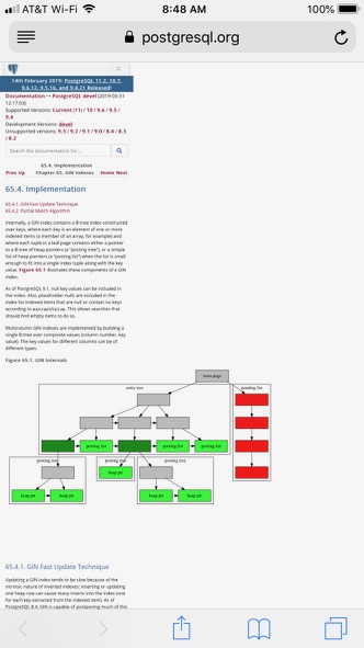
Hi,

First, many thanks on all the hard work for getting images into the
documentation, this is certainly a great new feature for ours users.

When testing the rendering of the images on the pgweb docs, I discovered
that they are not responsive (see attached) and in its current state,
basically makes any page that loads an image significantly more
challenging to read on mobile.

I've devised a solution to the problem, which will take work both on the
pgweb front as well as the SVG image generation.

The pgweb side is relatively simple: wherever we see ".figure" we can
tack on ".col-xl-8.col-lg-10.col-md-12" (Bootstrap grid codes) which
provides some readable images.

However, that in itself will not make the images responsive. It appears
that the width/height are at present hardcoded onto the SVG, for example
in doc/src/sgml/images/gin.svg you find:

<svg width="836pt" height="432pt" viewBox="0.00 0.00 836.00 432.00" ...

In order to make the SVG responsive, we can change the top line to be:

<svg viewBox="0.00 0.00 836.00 432.00" preserveAspectRatio="xMinYMin
meet" ...

and this fixes it. If/when the change is accepted, I can push the change
to the pgweb code that allows for the responsiveness.

I can fairly easy come up with a patch to do this for the current SVGs
(attached). I tested against the PDF build and it looks fine.

Based on the earlier discussions, I'm wondering how we would want to
proceed for future images, as I know the goal is to limit the amount of
manual editing once an image is generated.

Thanks,

Jonathan
Вложения
On 2019-03-31 16:23, Jonathan S. Katz wrote:
> When testing the rendering of the images on the pgweb docs, I discovered
> that they are not responsive (see attached) and in its current state,
> basically makes any page that loads an image significantly more
> challenging to read on mobile.

Image scaling is currently intentionally disabled for the HTML output
(see ignore.image.scaling in stylesheet-html-common.xsl).  But if we
turn it on, then the images will automatically be huge if you have large
screen.  Is that better?

--
Peter Eisentraut              http://www.2ndQuadrant.com/
PostgreSQL Development, 24x7 Support, Remote DBA, Training & Services
On 4/1/19 5:57 AM, Peter Eisentraut wrote:
> On 2019-03-31 16:23, Jonathan S. Katz wrote:
>> When testing the rendering of the images on the pgweb docs, I discovered
>> that they are not responsive (see attached) and in its current state,
>> basically makes any page that loads an image significantly more
>> challenging to read on mobile.
>
> Image scaling is currently intentionally disabled for the HTML output
> (see ignore.image.scaling in stylesheet-html-common.xsl).  But if we
> turn it on, then the images will automatically be huge if you have large
> screen.  Is that better?

Yes - we can control how much of the screen the image will take up with
the Bootstrap grid CSS classes, which is what the patch on the pgweb
side does.

Thanks,

Jonathan
Вложения
On 2019-04-01 13:23, Jonathan S. Katz wrote:
>> Image scaling is currently intentionally disabled for the HTML output
>> (see ignore.image.scaling in stylesheet-html-common.xsl).  But if we
>> turn it on, then the images will automatically be huge if you have large
>> screen.  Is that better?
>
> Yes - we can control how much of the screen the image will take up with
> the Bootstrap grid CSS classes, which is what the patch on the pgweb
> side does.

How do you do it outside of Bootstrap?

--
Peter Eisentraut              http://www.2ndQuadrant.com/
PostgreSQL Development, 24x7 Support, Remote DBA, Training & Services
On 4/1/19 8:22 AM, Peter Eisentraut wrote:
> On 2019-04-01 13:23, Jonathan S. Katz wrote:
>>> Image scaling is currently intentionally disabled for the HTML output
>>> (see ignore.image.scaling in stylesheet-html-common.xsl).  But if we
>>> turn it on, then the images will automatically be huge if you have large
>>> screen.  Is that better?
>>
>> Yes - we can control how much of the screen the image will take up with
>> the Bootstrap grid CSS classes, which is what the patch on the pgweb
>> side does.
>
> How do you do it outside of Bootstrap?

Effectively you're adjusting the width of the container, in this case,
as a percentage.

So borrowing from upthread, Bootstrap divides your viewport into 12
columns. In the "large screen" format, I specified for the image to load
within 8 of those columns (col-xl-8) which is equiv to a width of 75% of
the viewport.

Jonathan
Вложения
Here is a patch to improve this a bit.  It turns back on making the SVG
images in the HTML output scale with the page size.  I also added some
CSS stuff to make the width 75% on large screens for a more pleasing look.

This fixes it for the gin image.  The pagelayout image still doesn't
scale, presumably for the reasons you identified inside the SVG code.

--
Peter Eisentraut              http://www.2ndQuadrant.com/
PostgreSQL Development, 24x7 Support, Remote DBA, Training & Services
Вложения
On 4/4/19 7:17 AM, Peter Eisentraut wrote:
> Here is a patch to improve this a bit.  It turns back on making the SVG
> images in the HTML output scale with the page size.  I also added some
> CSS stuff to make the width 75% on large screens for a more pleasing look.
>
> This fixes it for the gin image.  The pagelayout image still doesn't
> scale, presumably for the reasons you identified inside the SVG code.

Tested against the local patch I have for pgweb for importing the docs
with appropriate classes. The GIN SVG does indeed scale properly, thanks!

As you mention, pagelayout still does not properly scale as it needs the
fix to scale.

Given you kept the gin.svg as is and that has some of the widths on it,
I'd propose we just add the viewbox on pagelayout.svg, i.e.

    viewBox="0.00 0.00 610.00 210.00"

Fix attached. I tested this in both the HTML build and with the import
into pgweb with new patch, and it scaled correctly.

Thanks,

Jonathan