| От | Jonathan S. Katz |
|---|---|
| Тема | Responsive images in pgweb docs |
| Дата | |
| Msg-id | 6d2442d1-84a2-36ef-e014-b6d1ece8a139@postgresql.org обсуждение |
| Ответы |
Re: Responsive images in pgweb docs
|
| Список | pgsql-docs |
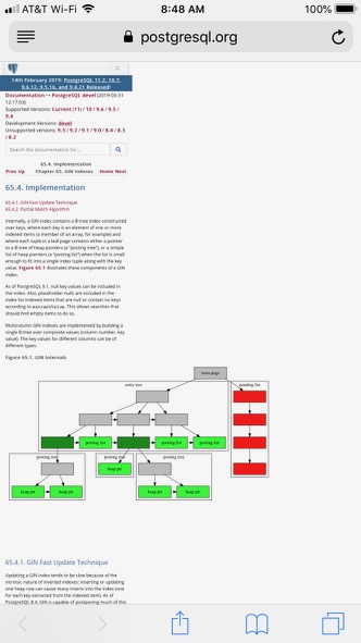
Hi,

First, many thanks on all the hard work for getting images into the
documentation, this is certainly a great new feature for ours users.

When testing the rendering of the images on the pgweb docs, I discovered
that they are not responsive (see attached) and in its current state,
basically makes any page that loads an image significantly more
challenging to read on mobile.

I've devised a solution to the problem, which will take work both on the
pgweb front as well as the SVG image generation.

The pgweb side is relatively simple: wherever we see ".figure" we can
tack on ".col-xl-8.col-lg-10.col-md-12" (Bootstrap grid codes) which
provides some readable images.

However, that in itself will not make the images responsive. It appears
that the width/height are at present hardcoded onto the SVG, for example
in doc/src/sgml/images/gin.svg you find:

<svg width="836pt" height="432pt" viewBox="0.00 0.00 836.00 432.00" ...

In order to make the SVG responsive, we can change the top line to be:

<svg viewBox="0.00 0.00 836.00 432.00" preserveAspectRatio="xMinYMin
meet" ...

and this fixes it. If/when the change is accepted, I can push the change
to the pgweb code that allows for the responsiveness.

I can fairly easy come up with a patch to do this for the current SVGs
(attached). I tested against the PDF build and it looks fine.

Based on the earlier discussions, I'm wondering how we would want to
proceed for future images, as I know the goal is to limit the amount of
manual editing once an image is generated.

Thanks,

Jonathan
В списке pgsql-docs по дате отправления:
Сайт использует файлы cookie для корректной работы и повышения удобства. Нажимая кнопку «Принять» или продолжая пользоваться сайтом, вы соглашаетесь на их использование в соответствии с Политикой в отношении обработки cookie ООО «ППГ», в том числе на передачу данных из файлов cookie сторонним статистическим и рекламным службам. Вы можете управлять настройками cookie через параметры вашего браузера