Обсуждение: Re: [pgadmin-hackers][patch] Style updates
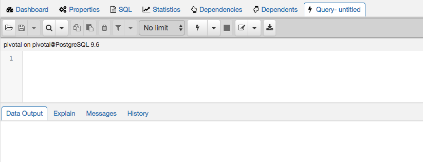
This patch includes changes to the popped out mode as well as the right color background behind the buttons:
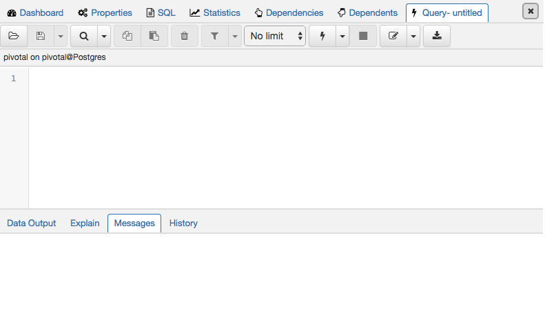
Popped out:

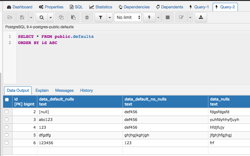
Regular:

Cheers!
Tira & Shirley
On Wed, Apr 5, 2017 at 3:45 PM, Shirley Wang <swang@pivotal.io> wrote:
Actually, we found an error with the patch and are going to resubmit it tomorrow once we fix the issue!ShirleyOn Wed, Apr 5, 2017 at 2:09 PM Atira Odhner <aodhner@pivotal.io> wrote:Hi Hackers,Matt and Sarah sat with our designer Shirley this week to do a couple of updates to the styles of the app. In particular, they changed the styles of the main tabs and the colors of the sql editor.Attached is a patch and a screenshot of the updated tabs and colors.
Tira & Matt
Вложения
Hi
--
This introduces a number of display issues for me:
- There are now gaps between the tabs and their content panels. See screenshot 1.
- The tabs on the higher-level panels no longer match the styling of the tabs on dialogues, which still follow the original style.
- The font in detached/floating tabs is hard to read as I think it's too bold. We have similar outstanding problems in a couple of other places, mostly the dashboards and the subnode control headers.
- I think the white outline for detached/floating tabs is too harsh. Maybe make it a very light gray?
- I think the softened contrast in the query tool makes it much harder to visually distinguish different parts of the display. See ss2 for example - the info bar, codemirror gutter, codemirror text area and button bar all blend together now (yet, with the column selection patch you've gone perhaps too far the other way by making the row selector column in the grid dark blue to match the column headers).
- There's also a visible gap between the top of codemirror and the bottom of the info bar.
Overall I think this is heading in the right direction, but needs some tweaks to fix anomalies and increased contrast in a few places.
On Thu, Apr 6, 2017 at 4:24 PM, Atira Odhner <aodhner@pivotal.io> wrote:
This patch includes changes to the popped out mode as well as the right color background behind the buttons:Popped out:
Regular:Cheers!Tira & Shirley
On Wed, Apr 5, 2017 at 3:45 PM, Shirley Wang <swang@pivotal.io> wrote:Actually, we found an error with the patch and are going to resubmit it tomorrow once we fix the issue!ShirleyOn Wed, Apr 5, 2017 at 2:09 PM Atira Odhner <aodhner@pivotal.io> wrote:Hi Hackers,Matt and Sarah sat with our designer Shirley this week to do a couple of updates to the styles of the app. In particular, they changed the styles of the main tabs and the colors of the sql editor.Attached is a patch and a screenshot of the updated tabs and colors.
Tira & Matt
--
Sent via pgadmin-hackers mailing list (pgadmin-hackers@postgresql.org)
To make changes to your subscription:
http://www.postgresql.org/mailpref/pgadmin-hackers


Dave Page
Blog: http://pgsnake.blogspot.com
Twitter: @pgsnake
EnterpriseDB UK: http://www.enterprisedb.com
The Enterprise PostgreSQL Company
Blog: http://pgsnake.blogspot.com
Twitter: @pgsnake
EnterpriseDB UK: http://www.enterprisedb.com
The Enterprise PostgreSQL Company
Вложения
Hello

On Fri, Apr 7, 2017 at 6:04 AM Dave Page <dpage@pgadmin.org> wrote:
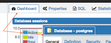
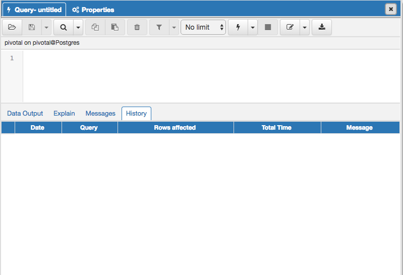
HiThis introduces a number of display issues for me:- There are now gaps between the tabs and their content panels. See screenshot 1.
Yes, that gap will be gone once we style the table. Mind if that's split up? Just wanted to focus on the top half of query editor with this patch.
- The tabs on the higher-level panels no longer match the styling of the tabs on dialogues, which still follow the original style.
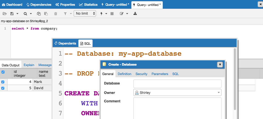
Do you mean they're different color wise? Would you prefer high-level panels to match all dialogs (whether they're from menu options or detached tabs)?
ie. something like this? (please ignore the giant SQL text)
- The font in detached/floating tabs is hard to read as I think it's too bold. We have similar outstanding problems in a couple of other places, mostly the dashboards and the subnode control headers.
Yes, agreed. We can change the boldness of detatched tabs to match the weight of high level panel. I'll put font weight changes for dashboard and subnode control headers in our list of css updates to make.
- I think the white outline for detached/floating tabs is too harsh. Maybe make it a very light gray?
Ok, I'm going to play around with contrast a bit more.
- I think the softened contrast in the query tool makes it much harder to visually distinguish different parts of the display. See ss2 for example - the info bar, codemirror gutter, codemirror text area and button bar all blend together now (yet, with the column selection patch you've gone perhaps too far the other way by making the row selector column in the grid dark blue to match the column headers).
Ah, yes, it seems like when you open a query from 'View ... rows" right click menu, the text editor is gray. That should be white - will fix this.
- There's also a visible gap between the top of codemirror and the bottom of the info bar.
I think the gap is from borders around the buttons being close to border of the bar. Removing the border around buttons seems to address the gap (see screenshot above). Some of the spacing between buttons needs to be adjusted, but what do you think?
Shirley
Вложения
Hi
--
On Fri, Apr 7, 2017 at 4:08 PM, Shirley Wang <swang@pivotal.io> wrote:
HelloOn Fri, Apr 7, 2017 at 6:04 AM Dave Page <dpage@pgadmin.org> wrote:HiThis introduces a number of display issues for me:- There are now gaps between the tabs and their content panels. See screenshot 1.Yes, that gap will be gone once we style the table. Mind if that's split up? Just wanted to focus on the top half of query editor with this patch.
No, we need to do it all at once - I may need to cut releases at any time.
- The tabs on the higher-level panels no longer match the styling of the tabs on dialogues, which still follow the original style.Do you mean they're different color wise? Would you prefer high-level panels to match all dialogs (whether they're from menu options or detached tabs)?
The lower level ones still have the old styling. I think they should all match.
ie. something like this? (please ignore the giant SQL text)
Potentially :-)
- The font in detached/floating tabs is hard to read as I think it's too bold. We have similar outstanding problems in a couple of other places, mostly the dashboards and the subnode control headers.Yes, agreed. We can change the boldness of detatched tabs to match the weight of high level panel. I'll put font weight changes for dashboard and subnode control headers in our list of css updates to make.- I think the white outline for detached/floating tabs is too harsh. Maybe make it a very light gray?Ok, I'm going to play around with contrast a bit more.- I think the softened contrast in the query tool makes it much harder to visually distinguish different parts of the display. See ss2 for example - the info bar, codemirror gutter, codemirror text area and button bar all blend together now (yet, with the column selection patch you've gone perhaps too far the other way by making the row selector column in the grid dark blue to match the column headers).Ah, yes, it seems like when you open a query from 'View ... rows" right click menu, the text editor is gray. That should be white - will fix this.
No - it's intentionally gray to indicate that the query is read-only. I think the info bar needs to not be gray if anything, to break up the view.
- There's also a visible gap between the top of codemirror and the bottom of the info bar.I think the gap is from borders around the buttons being close to border of the bar. Removing the border around buttons seems to address the gap (see screenshot above). Some of the spacing between buttons needs to be adjusted, but what do you think?
It's the gap at the top of the codemirror gutter, below the info bar that I'm complaining about - in the screen shot above it looks better, but I think there's still a pixel or two there.
Thanks!
Shirley
Dave Page
Blog: http://pgsnake.blogspot.com
Twitter: @pgsnake
EnterpriseDB UK: http://www.enterprisedb.com
The Enterprise PostgreSQL Company
Blog: http://pgsnake.blogspot.com
Twitter: @pgsnake
EnterpriseDB UK: http://www.enterprisedb.com
The Enterprise PostgreSQL Company