Hi
This introduces a number of display issues for me:
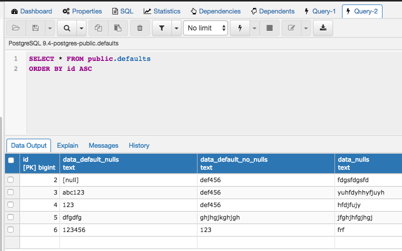
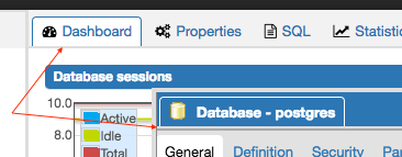
- There are now gaps between the tabs and their content panels. See screenshot 1.
- The tabs on the higher-level panels no longer match the styling of the tabs on dialogues, which still follow the original style.
- The font in detached/floating tabs is hard to read as I think it's too bold. We have similar outstanding problems in a couple of other places, mostly the dashboards and the subnode control headers.
- I think the white outline for detached/floating tabs is too harsh. Maybe make it a very light gray?
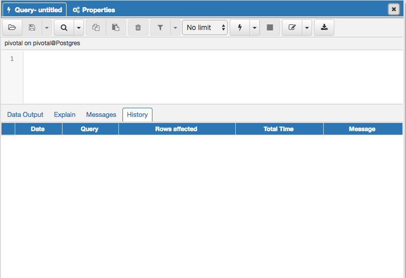
- I think the softened contrast in the query tool makes it much harder to visually distinguish different parts of the display. See ss2 for example - the info bar, codemirror gutter, codemirror text area and button bar all blend together now (yet, with the column selection patch you've gone perhaps too far the other way by making the row selector column in the grid dark blue to match the column headers).
- There's also a visible gap between the top of codemirror and the bottom of the info bar.
Overall I think this is heading in the right direction, but needs some tweaks to fix anomalies and increased contrast in a few places.