Обсуждение: Improvement of GIN figure
To increase the consistency between the surrounding, explaining text and
the figure, there are some changes and additions to the texts within the
figure.

Also: Added a hint in README for ditaa developers.


Jürgen Purtz
Вложения
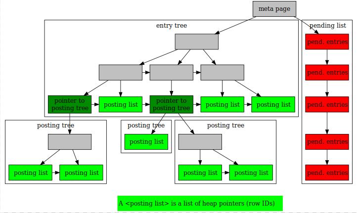
On Sun, Jul 7, 2019 at 4:18 PM Jürgen Purtz <juergen@purtz.de> wrote:
>
> To increase the consistency between the surrounding, explaining text and
> the figure, there are some changes and additions to the texts within the
> figure.

Sorry, I may missed the discussion of what colors and fonts we accept
for our documentation, but
the color and fonts used I don't like. I attached our version of GIN figure.

>
> Also: Added a hint in README for ditaa developers.
>
>
> Jürgen Purtz
>
>


--
Postgres Professional: http://www.postgrespro.com
The Russian Postgres Company
Вложения
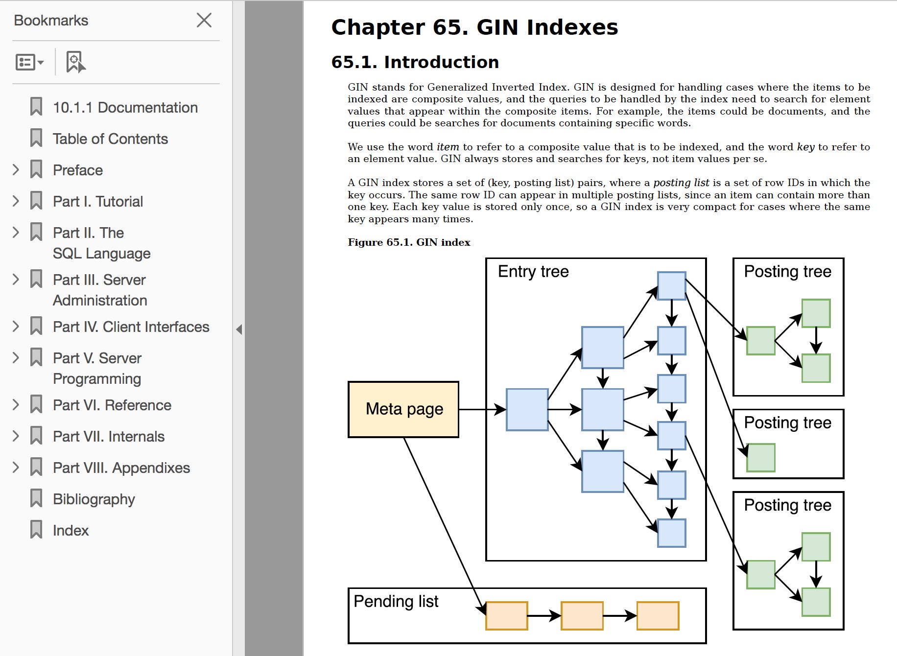
On Tue, Jul 9, 2019 at 12:20 AM Oleg Bartunov <obartunov@postgrespro.ru> wrote:
> Sorry, I may missed the discussion of what colors and fonts we accept
> for our documentation, but
> the color and fonts used I don't like. I attached our version of GIN figure.

I agree that the existing colors look awful, and that muted pastel
colors would work better. Doesn't seem like something that should
happen at the cost of making the diagram less informative, though.

--
Peter Geoghegan
> I agree that the existing colors look awful, and that muted pastel
> colors would work better. Doesn't seem like something that should
> happen at the cost of making the diagram less informative, though.

I am not an expert in the area but I think we should cosider people
with color disability.

https://www.invisionapp.com/inside-design/color-accessibility-product-design/

Best regards,
--
Tatsuo Ishii
SRA OSS, Inc. Japan
English: http://www.sraoss.co.jp/index_en.php
Japanese:http://www.sraoss.co.jp
On Tue, Jul 9, 2019 at 3:22 PM Tatsuo Ishii <ishii@sraoss.co.jp> wrote:
> > I agree that the existing colors look awful, and that muted pastel
> > colors would work better. Doesn't seem like something that should
> > happen at the cost of making the diagram less informative, though.
>
> I am not an expert in the area but I think we should cosider people
> with color disability.

Good point. I think that that shouldn't be too hard to mostly get right.

It's good that the diagrams will already work with a screen reader.

--
Peter Geoghegan
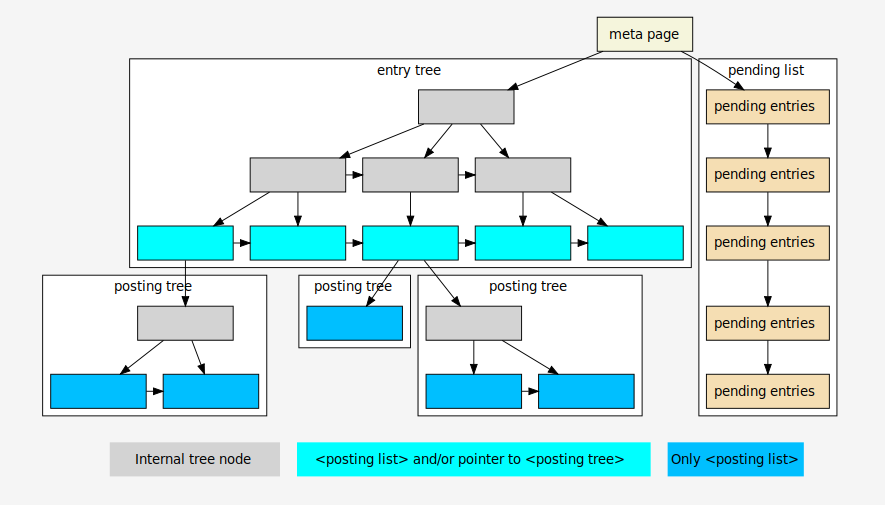
> On Tue, Jul 9, 2019 at 3:22 PM Tatsuo Ishii <ishii@sraoss.co.jp> wrote:
>>> I agree that the existing colors look awful, and that muted pastel
>>> colors would work better. Doesn't seem like something that should
>>> happen at the cost of making the diagram less informative, though.
>> I am not an expert in the area but I think we should cosider people
>> with color disability.
> Good point. I think that that shouldn't be too hard to mostly get right.
>
> It's good that the diagrams will already work with a screen reader.
>
Due to the discussions of recent days as well as some improvements of
the graphiz know-how, the graphic is subject to many changes: different
colors (variations of 'PG blue', and possibly helpful for people with
color vision deficiency), a different font (adaption to the font in PG's
documentation), changes in the meaning and explanation of nodes (as a
result of discussion with Oleg Bartunov), introduction of a - hopefully
unobtrusive - background color (to circumvent graphic from text), use of
DOT syntax.